> ## Documentation Index
> Fetch the complete documentation index at: https://docs.sprig.com/llms.txt
> Use this file to discover all available pages before exploring further.
# Styling Studies with Custom CSS
**You can add and override the CSS applied to Sprig In-Product Surveys and Feedback to completely re-work its appearance to match your branding guidelines and requirements.**
Some look and feel styling is built into the Sprig dashboard by default. Other customizations require CSS styling. The guidance here is a deeper dive into how the CSS editor works and how to safely override default rules.
Custom CSS styling is done separately for In-Product Surveys and Feedback, and can be done in:
* Settings > Surveys > Look & Feel > CSS OR
* Settings > Feedback > Look & Feel > CSS
**Note:** currently Sprig only supports 1 CSS styling theme per Sprig Product. Per study styling is coming soon!
**Styling for dark mode?** Sprig studies can follow the respondent's system appearance. The code shown in the editor below is a **light-mode-only snapshot** and does not include the CSS variables the dark stylesheet relies on. See [Dark Mode](/docs/developer-center/styling/dark-mode) before adding any color rules.
### Introduction
A single CSS file applies to all survey question types, although some CSS selectors only apply to HTML elements on specific survey types. **Any un-commented out CSS you add will override the default styling to all surveys when saved, including any in-progress studies. Do proceed with caution when applying.**
When you open the Custom CSS editor, you’ll see a block of commented-out code. These aren’t “extra” styles you need to delete or modify, they’re simply the default Sprig styles shown for reference. You can ignore them if you like or choose to clear the window.
### Basic instructions:
* **Add your own CSS below the comments, or replace selectors with your own.**
* The default file is organized by general styles and question-type-specific styles.
* You can make modifications directly in this editor or paste in your own CSS.
* **Use the preview panel to test changes across question types.**
* The preview will update with the changes you make to your CSS. You can select each of the question types from underneath the preview to see how your custom CSS changes their appearance. Note that not all changes will be shown in previews until the CSS styling configurations are saved. We encourage testing in a development environment and then copy and pasting the curate styling into production.
* Defaults will remain unless overridden.
* Custom CSS applies to all surveys within a product, including active surveys.
### CSS variables
Underneath the selectors shown in the editor, Sprig's stylesheets are built on **CSS custom properties** (variables) for color, e.g. `--text-color`, `--background-color`, `--selection-background-color`. Every selector below reads its color from one of these variables rather than a hardcoded value.
You don't need to touch variables to use custom CSS; overriding a selector directly (as shown throughout this page) works fine. Variables matter once you want the same color change to apply automatically in both light and dark mode, since a variable you set once is picked up everywhere Sprig uses it.
The full variable reference, and the three patterns for using them, live on the [Dark Mode](/docs/developer-center/styling/dark-mode#css-variable-reference) page rather than duplicated here.
## The Practical Guide
The 600+ lines of default CSS have JSDoc style comments that organize all the selectors.
* [Base Typography](#base-typography)
* [Universal Elements](#universal-elements)
* [Card Component](#card-component)
* [Rich Text](#rich-text)
* [Choice Elements](#choice-elements)
* [Buttons](#buttons)
* [Matrix Questions](#matrix-questions)
* [One to Five Scale (Likert)](#one-to-five-scale-likert)
* [NPS Question](#nps-question)
* [Open Text Card](#open-text-card)
* [Text or URL Prompt](#text-or-url-prompt)
* [Consent or Legal Card](#consent-or-legal-card)
* [Rank Order](#rank-order)
* [AI Follow-Up & AI Dynamic Question](#ai-follow-up-and-ai-dynamic-question)
* [Thank You Card](#thank-you-card)
* [Feedback Button & Container](#feedback-button-and-container)
Sprig has also curated 2 different quick "Choose-your-own-theme" [recipes](#quick-recipes), shown below!
#### Base Typography
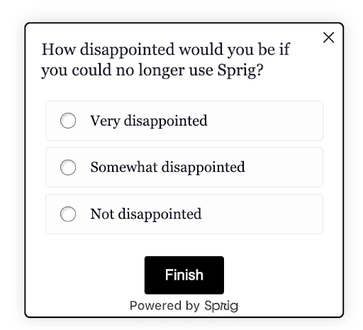
What it controls: global text feel.
```css Try: theme={null}
/* Brand font */
html, body { font-family: 'Georgia', serif; }
```
`html`, `body`, `b`
#### Universal Elements
What it controls: the little bits around the card (footers, dots, close button).
```css Try: theme={null}
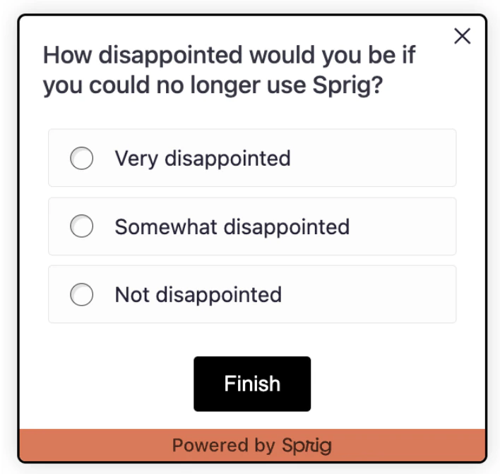
/* Increased footer spacing & add color */
.ul-footer { margin-top: 12px; background-color: #e97451; }
/* Increase size of the close icon */
.close-btn { height: 18px; width: 18px;}
```
`.ul-footer`, `.ul-footer-bubble`, `.close-container`, `.close-btn`
#### Card Component
What it controls: the survey “card”, padding, shadow, radius.
```css Try: theme={null}
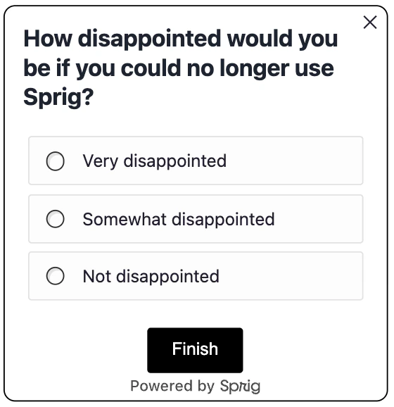
/* Rounded, no heavy shadow */
.ul-card__container--desktop, .ul-card__container--mobile {
border-radius: 10px;
box-shadow: none;
}
/* Headline + subcopy tone */
.ul-question { font-size: 20px; font-weight: 700; color: #1f2937; }
```
`.ul-card`, `.ul-card__container--desktop`, `.ul-card__container--mobile`, `.ul-card__container`, `.ul-card-main-content`, `.ul-question`, `.ul-caption`
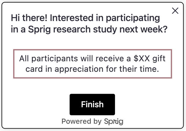
#### Rich Text
What it controls: paragraphs and lists in rich text cards.
```css Try: theme={null}
/* Visual focus on rich text */
.ul-rich-text-body p, .ul-rich-text-body li {
text-align: center;
padding: 5px;
border: #b18187 3px solid;
}
```
`.ul-rich-text-body`, `.ul-rich-text-body p`, `.ul-rich-text-body li`
#### Choice Elements
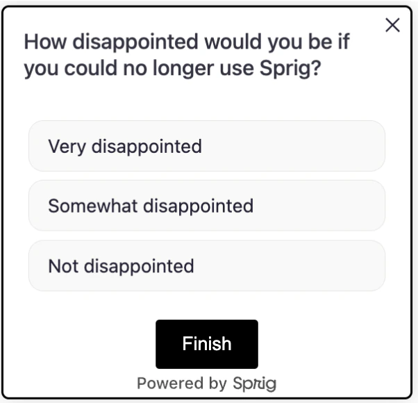
What it controls: option "buttons," spacing, radio dots, labels (multiple choice, multi-select, matrix options).
```css Try: theme={null}
/* Space the list a bit */
.ul-card__choices--desktop { margin-top: 16px; }
/* Button-like options */
.choice { background: #f9f9f8; border-radius: 12px; }
/* Hide radio circles for a cleaner look */
.select-radio { display: none; }
```
`.ul-card--multiple`, `.ul-card__choices--desktop`, `.ul-card__choices--mobile`, `.ul-card__choices`, `.choice--mobile`, `.choice--desktop` (has `:hover`/`:active` states), `.choice`, `.select-label`, `.select-radio`, `.ul-select-active-dynamic-style .select-radio`
#### Buttons
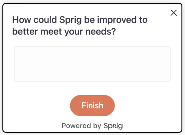
What it controls: primary/secondary actions (finish/submit). Buttons appear across nearly every question type, not just one, so this section sits with the other general-purpose selectors above.
```css Try: theme={null}
/* Rounded (pill-shape) primary action */
.ul-card-text__button {
border-radius: 20px;
background: #e97451;
color: #fff;
}
```
`.ul-card-text__button`, `.ul-card-text__button:disabled`, `.ul-card__button-wrapper`, `.ul-card-skip__button`
#### Matrix Questions
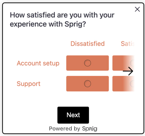
What it controls: row/column labels and cells.
```css Try: theme={null}
/* Colorful matrix background & label text */
.ul-matrix-option-wrapper {
background-color: #e97451;
margin: 4px;
border-radius: 3px;
}
.ul-matrix-row-label, .ul-matrix-column-label {
background: white;
color: #e97451;
}
```
`.ul-card--matrix_grid`, `.ul-card--matrix_container`, `.ul-matrix-column-label`, `.ul-matrix-option-wrapper`, `.ul-matrix-last-option`, `.ul-matrix-row-label`
#### One to Five Scale (Likert)
What it controls: the row of numbers and labels beneath.
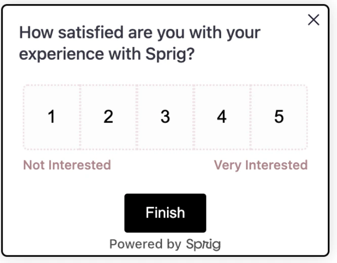
```css Try: theme={null}
/* Dotted borders on each number & mauve labels */
.likert-number--desktop { border: 2px #f1e1e7 dotted; }
.ul-card--likert__labels { color: #b18187; }
```
`.ul-card--likert`, `.ul-card--likert__numbers`, `.likert-number--mobile`, `.likert-number--desktop` (has `:hover`/`:active` states), `.likert-number`, `.ul-card--likert__labels`
#### NPS Question
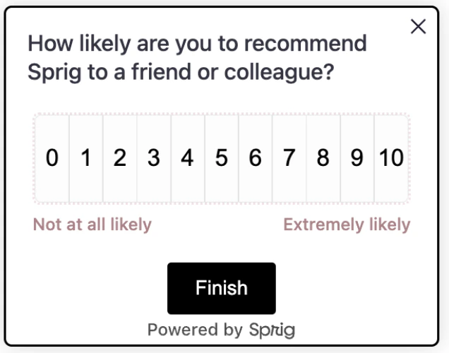
What it controls: the number grid and label row.
```css Try: theme={null}
/* Same visual language as Likert */
.ul-card--nps__numbers { border: 2px #f1e1e7 dotted; }
.ul-card--nps__labels { color: #b18187; }
```
`.ul-card--nps`, `.ul-card--nps__numbers`, `.nps-number--mobile`, `.nps-number--desktop` (has `:hover`/`:active` states), `.nps-number`, `.ul-card--nps__labels`
#### Open Text Card
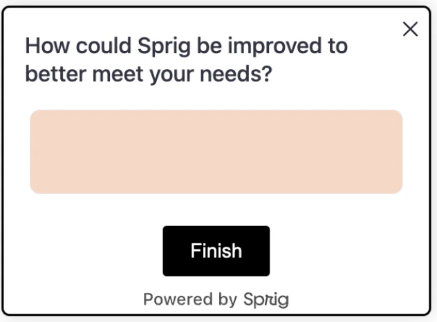
What it controls: text areas and their container.
```css Try: theme={null}
/* Peach background, rounder corners */
.ul-card-text__input { background: #fad6c3; border-radius: 8px; }
```
`.ul-card--text`, `.ul-card-text`, `.ul-card-text__container`, `.ul-card-text__input--mobile`, `.ul-card-text__input--desktop` (has a `:hover` state), `.ul-card-text__input` (has `::placeholder`/`:focus` states)
#### Text or URL Prompt
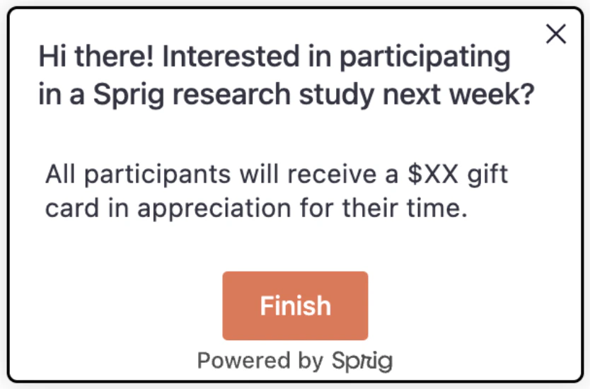
What it controls: the prompt button styling.
```css Try: theme={null}
/* Make prompt feel like a primary action */
.ul-card__text-url-prompt-button { background-color: #e97451 }
```
`.ul-card__text-url-prompt`, `.ul-card__text-url-prompt-button`
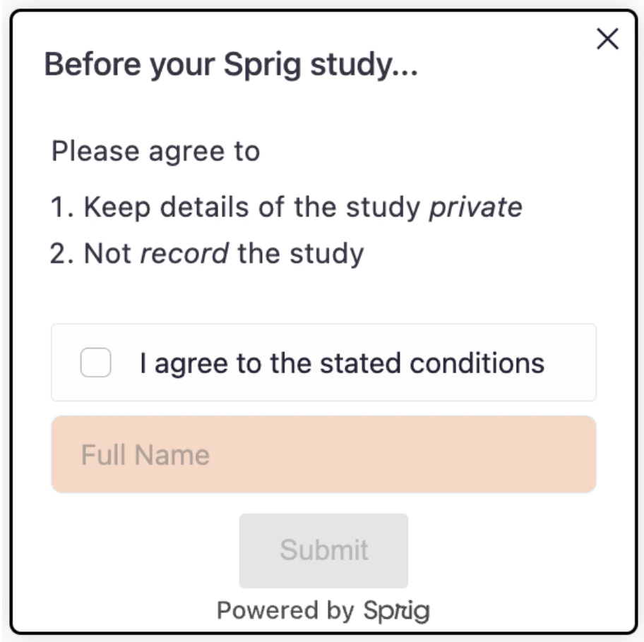
#### Consent or Legal Card
What it controls: name input and consent choices.
```css Try: theme={null}
/* Peach background, rounder corners */
.ul-consent-legal__name-input { background: #fad6c3; border-radius: 6px; }
```
`.ul-consent-legal__name-input--mobile`, `.ul-consent-legal__name-input--desktop` (has a `:hover` state), `.ul-consent-legal__name-input` (has `::placeholder`/`:focus` states), `.ul-card__consent-legal .choice`, `.ul-card__consent-legal .choice--desktop` (has `:hover`/`:active` states), `.ul-card__consent-legal .choice--mobile` (has an `:active` state)
#### Rank Order
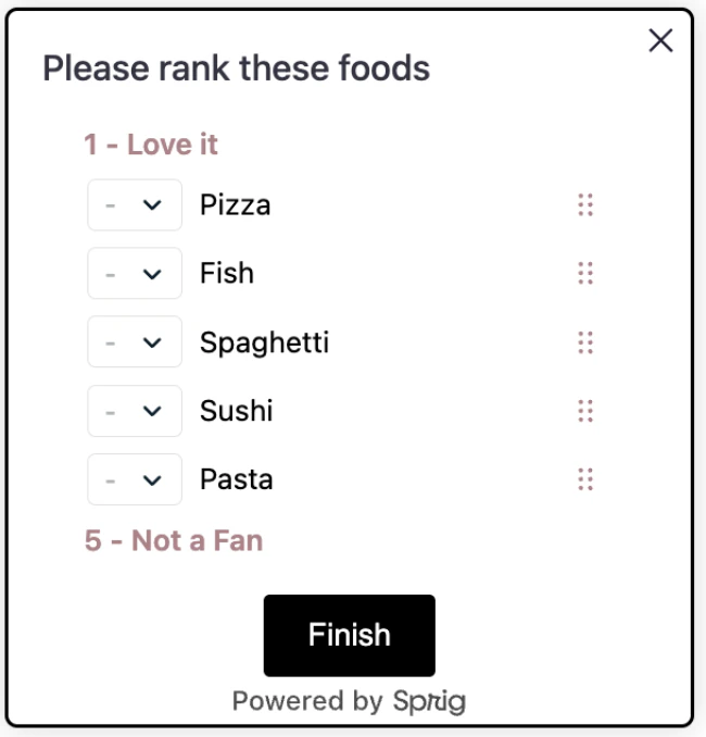
What it controls: draggable rows, drag handle, and the rank select dropdown.
```css Try: theme={null}
/* Rounder rows with a colored drag handle */
.ul-card-rank__option { border-radius: 12px; border-color: #b18187; }
.ul-card-rank__drag-btn { color: #b18187; }
/* Custom-colored rank select */
.ul-card-rank__select { border-color: #b18187; border-radius: 8px; }
```
`.ul-card-rank__labels`, `.ul-card--rank__question-inner-container`, `.ul-card-rank__list`, `.ul-card-rank__option` (has an `:active` state, plus `.is-dragging` and `.is-drop-target` modifier classes), `.ul-card-rank__option.is-drop-target select, .ul-card-rank__option.is-drop-target span, .ul-card-rank__option.is-drop-target button`, `.ul-card-rank__drag-btn` (has an `:active` state), `.ul-card-rank__option svg`, `.ul-card-rank__option span`, `.ul-card-rank__select`, `.ul-card-rank__select.ul-card-rank__select--placeholder`
#### AI Follow-Up & AI Dynamic Question
What it controls: the loading indicator shown while an AI Follow-Up or AI Dynamic Question is generated. Everything else on these question types shares styling with the [Open Text Card](#open-text-card).
```css Try: theme={null}
/* Slower, brand-colored shimmer */
.ul-card-text__input__loading {
background-image: linear-gradient(70deg, #b18187 0%, #f1e1e7 50%, #b18187 100%);
animation-duration: 3s;
}
```
`.ul-card-text__input__loading`
#### Thank You Card
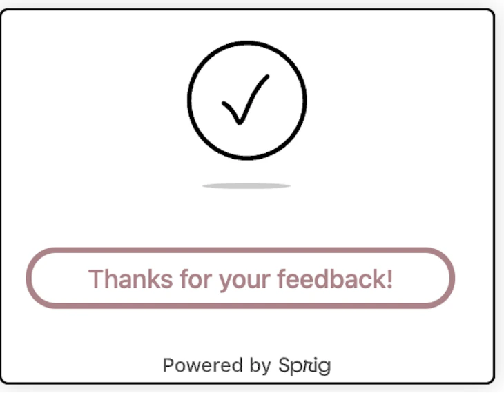
What it controls: closing screen layout and text.
```css Try: theme={null}
/* Colored checkmark, tighter closing copy */
.ul-thanks-check { color: #21522e; }
.ul-card--thanks .ul-question { font-weight: 700; }
.ul-card--thanks .ul-caption { color: #575653; }
```
`.ul-card--thanks`, `.ul-thanks-check`, `.ul-card--thanks-content`, `.ul-card--thanks .ul-question`, `.ul-card--thanks .ul-caption`
#### Feedback Button & Container
What it controls: the floating Feedback button and the container it opens into. These selectors are only relevant to the Feedback tab's CSS editor, not surveys.
```css Try: theme={null}
/* Rounder floating button */
#sprig-feedback-button { border-radius: 24px; }
```
**`.sprig-feedback-button-light` / `.sprig-feedback-button-dark` are not the same as the dark mode covered on the [Dark Mode](/docs/developer-center/styling/dark-mode) page.** These two classes correspond to the Feedback button's own **Light/Dark theme** setting in Look & Feel — a manual choice you make once for the button, not something that responds to the respondent's system appearance. If you want the Feedback button itself to follow `prefers-color-scheme`, you'll need to write that media query yourself against these selectors.
`#sprig-feedback-button`, `.sprig-feedback-button-label`, `.sprig-feedback-button-right`, `.sprig-feedback-button-bottom`, `.sprig-feedback-button-light`, `.sprig-feedback-button-dark`, `#sprig-feedback-container`, `.sprig-feedback-container-left`, `.sprig-feedback-container-center`, `.sprig-feedback-container-bottom`
## Quick Recipes
“Choose-Your-Own-Theme” recipes designed to help you tailor the look and feel of your studies.
These recipes are light-mode only. If dark mode is enabled for your product, pair them with a `@media (prefers-color-scheme: dark)` block — see [Dark Mode](/docs/developer-center/styling/dark-mode) for the patterns to use.
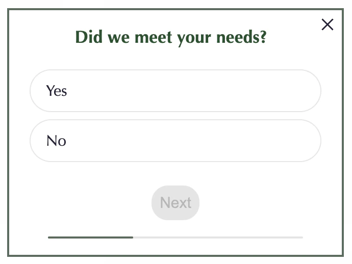
```css Minimal Branded Look theme={null}
body { font-family: Optima; }
.ul-card__container { border: #5a6b5f 2px solid; border-radius: 0; box-shadow: none; }
.ul-question { font-weight: 700; color: #21522e; text-align: center}
.choice { background: white; border-radius: 24px; }
.select-radio { display: none; }
.ul-card-text__button { border-radius: 16px; padding: 8px;}
```
```css High Contrast for Accessibility theme={null}
.ul-question { font-weight: 700; font-family: Verdana; color: #25283D; font-size: 22px; }
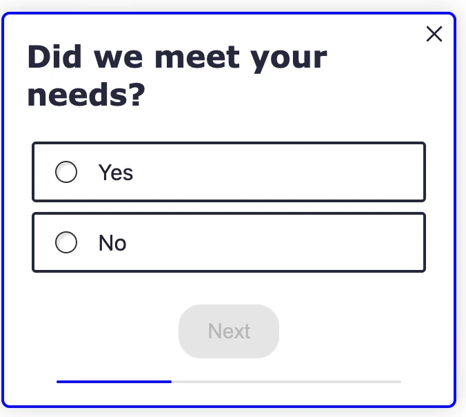
.choice { background: white; font-size: 16px; border: 2px solid #25283D; }
.ul-card-text__button { background: #25283D; color: #fff; border-radius: 16px; }
```