- Settings > Surveys > Look & Feel > CSS OR
- Settings > Feedback > Look & Feel > CSS
Note: currently Sprig only supports 1 CSS styling theme per Sprig Product. Per study styling is coming soon!
Introduction
A single CSS file applies to all survey question types, although some CSS selectors only apply to HTML elements on specific survey types. Any un-commented out CSS you add will override the default styling to all surveys when saved, including any in-progress studies. Do proceed with caution when applying. When you open the Custom CSS editor, you’ll see a block of commented-out code. These aren’t “extra” styles you need to delete or modify, they’re simply the default Sprig styles shown for reference. You can ignore them if you like or choose to clear the window.Basic instructions:
- Add your own CSS below the comments, or replace selectors with your own.
- The default file is organized by general styles and question-type-specific styles.
- You can make modifications directly in this editor or paste in your own CSS.
- Use the preview panel to test changes across question types.
- The preview will update with the changes you make to your CSS. You can select each of the question types from underneath the preview to see how your custom CSS changes their appearance. Note that not all changes will be shown in previews until the CSS styling configurations are saved. We encourage testing in a development environment and then copy and pasting the curate styling into production.
- Defaults will remain unless overridden.
- Custom CSS applies to all surveys within a product, including active surveys.
The Practical Guide
The 600+ lines of default CSS have JSDoc style comments that organize all the selectors.- Base Typography
- Universal Elements
- Card Component
- Rich Text
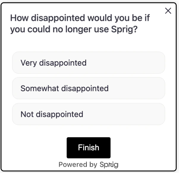
- Choice Elements
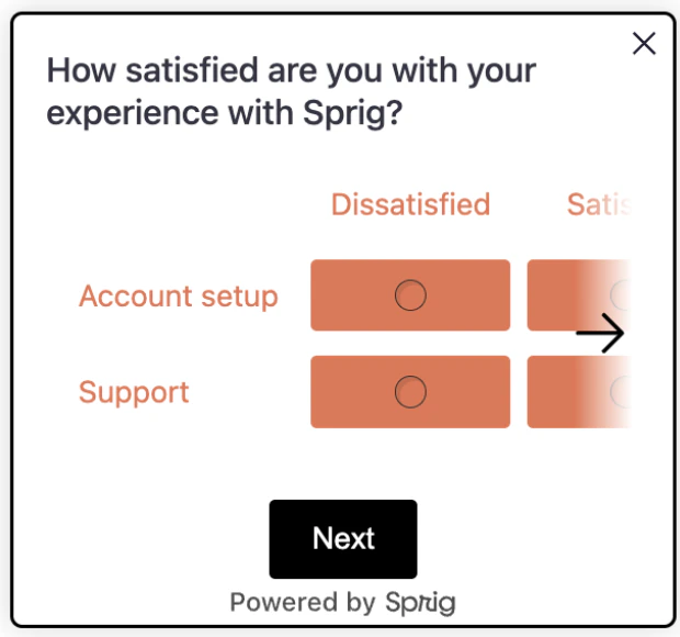
- Matrix Question
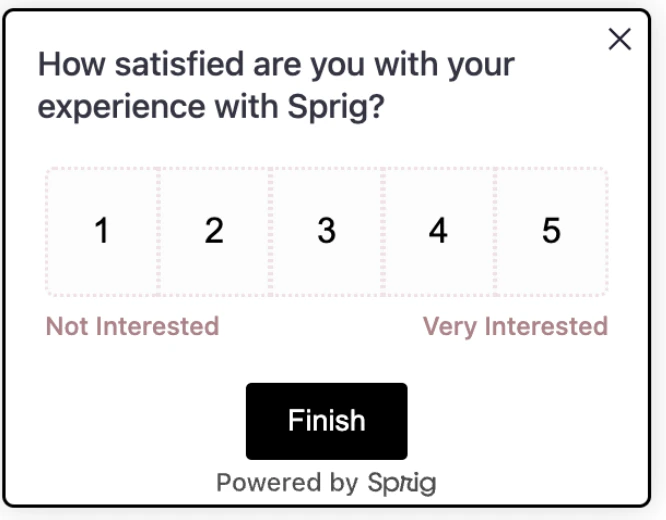
- One to Five Scale (Likert)
- NPS Question
- Open Text Card
- Text or URL Prompt
- Consent or Legal Card
- Rank Order
- Buttons
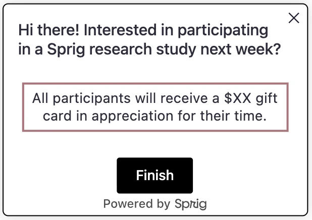
- Thank You Card
Base Typography
What it controls: global text feelKey selectors:
html, body, b
Try:
Universal Elements
What it controls: the little bits around the card (footers, dots, close button)Key selectors:
.ul-footer, .ul-footer-bubble, .close-btn
Try:
Card Component
What it controls: the survey “card”, padding, shadow, radius.Key selectors:
.ul-card, .ul-card__container, .ul-card-main-content, .ul-question, .ul-caption
Try:
Rich Text
What it controls: paragraphs and lists in rich text cards.Key selectors:
.ul-rich-text-body, .ul-rich-text-body p, .ul-rich-text-body li
Try:
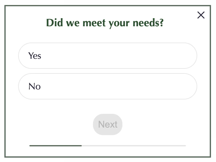
Choice Elements
What it controls: option “buttons,” spacing, radio dots, labels (multiple choice, multi-select, matrix options) Key selectors:Try:
Matrix Questions
What it controls: row/column labels and cells.Key selectors:
.ul-matrix-row-label, .ul-matrix-column-label, .ul-matrix-option-wrapper
Try:
One to Five Scale (Likert)
What it controls: the row of numbers and labels beneath.Key selectors:
.ul-card--likert__numbers, .likert-number--desktop|--mobile, .ul-card--likert__labels
Try:
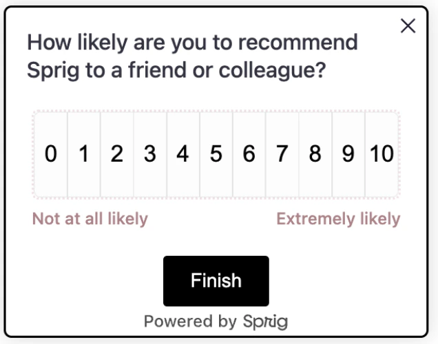
NPS Question
What it controls: the number grid and label row.Key selectors:
.ul-card--nps__numbers, .nps-number--desktop|--mobile, .ul-card--nps__labels
Try:
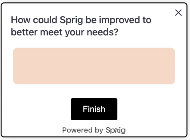
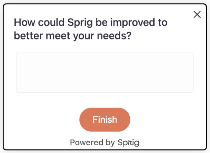
Open Text Card
What it controls: text areas and their container.Key selectors:
.ul-card-text__container, .ul-card-text__input(--desktop|--mobile)
Try:
Text or URL Prompt
What it controls: the prompt button styling.Key selectors:
.ul-card__text-url-prompt-button
Try:
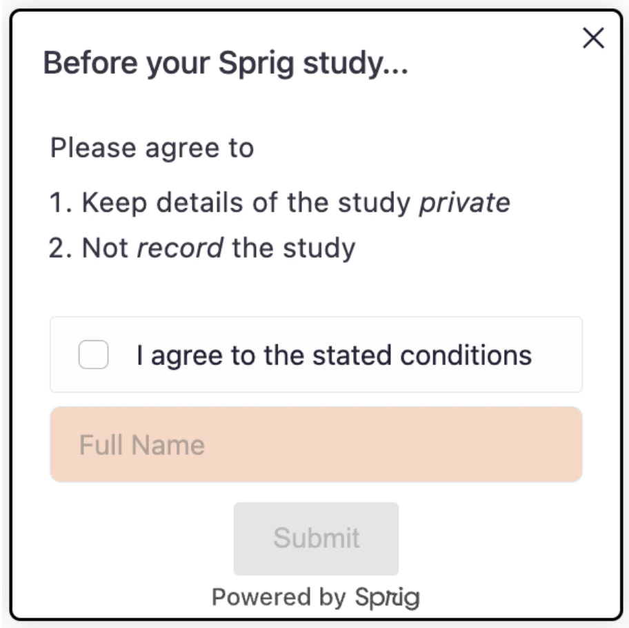
Consent or Legal Card
What it controls: name input and consent choices.Key selectors:
.ul-consent-legal__name-input, .ul-card__consent-legal .choice
Try:
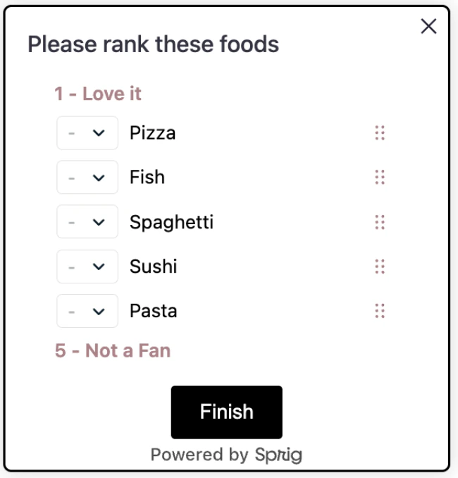
Rank Order
What it controls: draggable rows, handles, and select.Key selectors:
.ul-card-rank__option, .__drag-btn, .__select
Try:
Buttons
What it controls: primary/secondary actions (finish/submit)Key selectors:
.ul-card-text__button, .ul-card-skip__button, .ul-card__button-wrapper
Try:
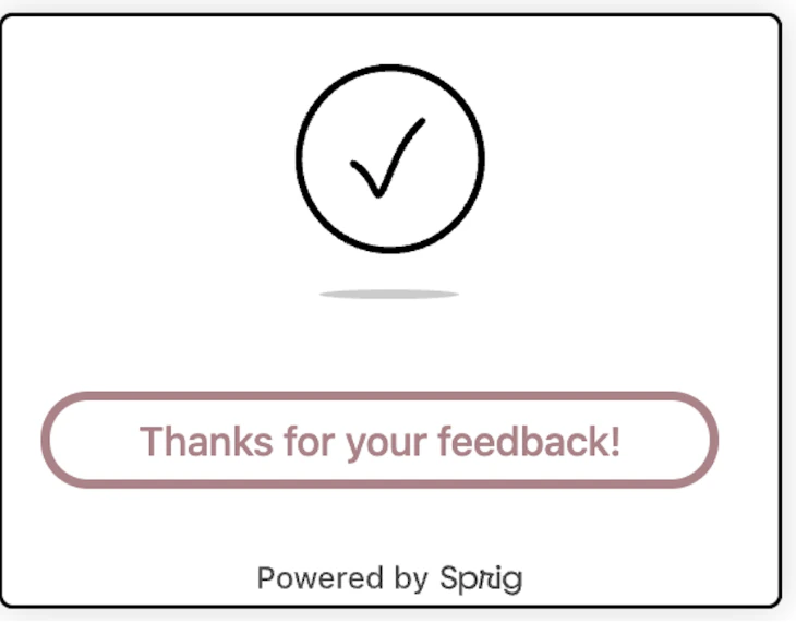
Thank You Card
What it controls: closing screen layout and text.Key selectors:
.ul-card--thanks, .ul-thanks-check, .ul-card--thanks .ul-question, .ul-card--thanks .ul-caption
Try:
Quick Recipes
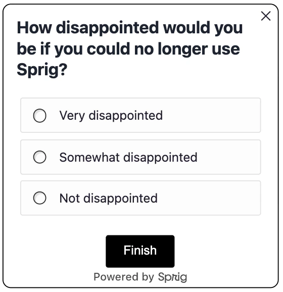
“Choose-Your-Own-Theme” recipes designed to help you tailor the look and feel of your studies.Minimal Branded Look
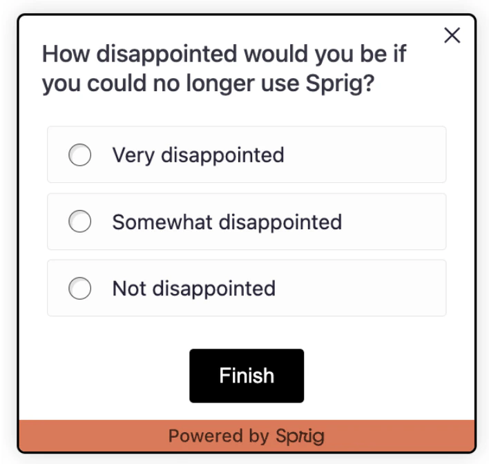
High Contrast for Accessibility