

prefers-color-scheme CSS, which you could always do (and still can on top of it). This page covers how the default works, how to brand it, and how it interacts with your custom CSS.
Default CSS dark mode shipped in Web SDK v2.49.0, and studies rendered in a mobile SDK need a version built against it: see Minimum SDK versions below.
Turning it on
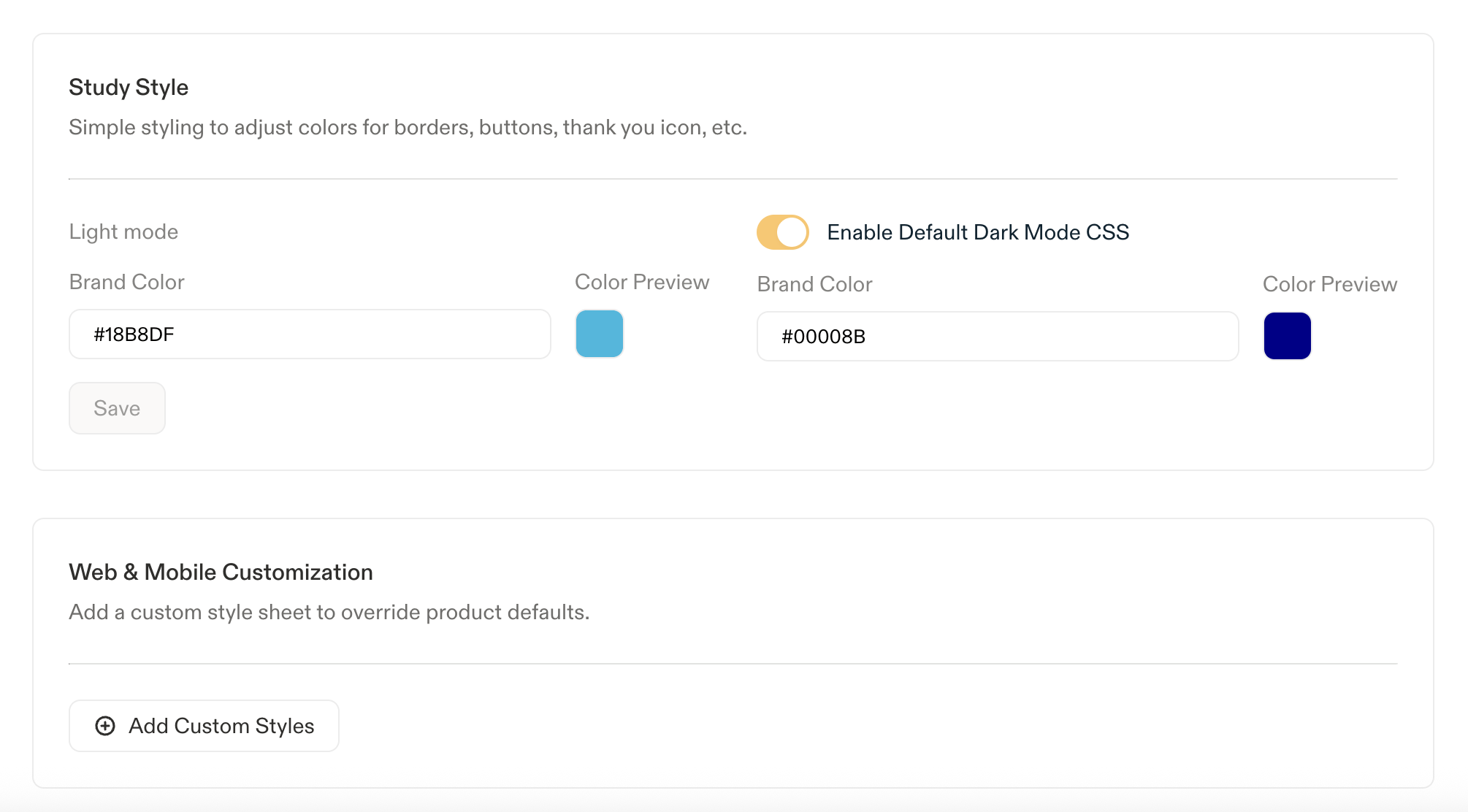
Only Admins and Developers can modify survey appearance. Go to Settings > Surveys > Look & Feel and switch on Enable Default Dark Mode CSS. This one toggle covers both surfaces: turning it on here enables the default dark theme for Feedback studies alongside In-Product Surveys. Same story for the Brand Color fields below, set once in Surveys > Look & Feel and they apply to Feedback too. Custom CSS is the one thing that stays separate: to override built-in styles for Feedback specifically, use its own editor at Settings > Feedback > Look & Feel > CSS. Once the toggle is on, a second Brand Color field appears for dark mode next to the existing light mode one. Each drives the--sprig-brand-color variable in its mode, controlling the default survey border, button background, radio fills, and other accent details, no CSS required.
How it works
Sprig loads a second stylesheet that responds to the respondent’s operating system or browser appearance setting via the standard CSS media query:Load order and specificity
How the CSS is applied:- Your custom CSS is injected after Sprig’s stylesheets. Your rules win at equal specificity. You do not need
!importantfor ordinary overrides. - Sprig’s dark values are declared on
:root, nothtml. Since:roothas higher specificity thanhtml, a variable you set onhtmlwill apply in light mode but be overridden by Sprig in dark mode.
The commented reference block in the CSS editor is light-mode only: a snapshot of Sprig’s selectors with hardcoded light colors, no variables or dark palette listed. Use the variable reference below when you’re working on dark mode.
Choosing an approach
Variables are a convenience, not a requirement: because every Sprig selector reads from them, changing one value updates everywhere that color is used. A plain
@media (prefers-color-scheme: dark) block with ordinary selector overrides works just as well, and is often clearer for a handful of elements. Use whichever fits your stylesheet.Approach 1: Do nothing (color-free customizations)
If your custom CSS only changes layout, spacing, typography, or border radius, it already works in both modes. Sprig’s colors keep flowing through the variables.Approach 2: Override selectors directly
No variables involved. Write your light-mode rules as usual, then re-declare whatever needs to change inside a@media (prefers-color-scheme: dark) block. Your custom CSS is injected after Sprig’s, so at equal specificity your rules win in both modes.
Approach 3: Override Sprig’s variables
The lowest-effort way to brand both modes. Set Sprig’s own variable names on:root for light, then re-declare the ones that need to change inside a dark media query. Every Sprig selector picks the new values up automatically.
Approach 4: Define your own tokens
If your company already maintains light/dark color pairs, declare them all up front, point a set of “active” tokens at the light values, and remap only the active tokens in the dark block. Your selectors then reference the active tokens and never need duplicating.CSS variable reference
These are the variables Sprig’s stylesheets read from, with the default value in each mode. Override any of them on:root. You only need this for Approach 3 or Approach 4 above; skip it otherwise.
This reference reflects Web SDK v2.49.0. Sprig may add variables in later versions; anything not listed here should be overridden by selector instead.
Core surfaces and text
Core surfaces and text
Choice and selection elements
Choice and selection elements
Question-type specific
Question-type specific
Conversational UI
Conversational studies load an additional dark stylesheet with its own variables for the chat transcript and inputs, overridden the same way: inside a@media (prefers-color-scheme: dark) block on :root. The most commonly overridden:
Conversational UI variables
Conversational UI variables
Testing your CSS
Because custom CSS applies to all studies in a product, including active ones, test both modes before you save. A Product’s CSS is one stylesheet shared by its development and production environments, so saving updates both at once. A sun/moon switcher is available in two places: One sits above the preview in the custom CSS editor (Settings > Surveys > Look & Feel > Add Custom Styles), a sandbox: nothing here goes live until you hit save.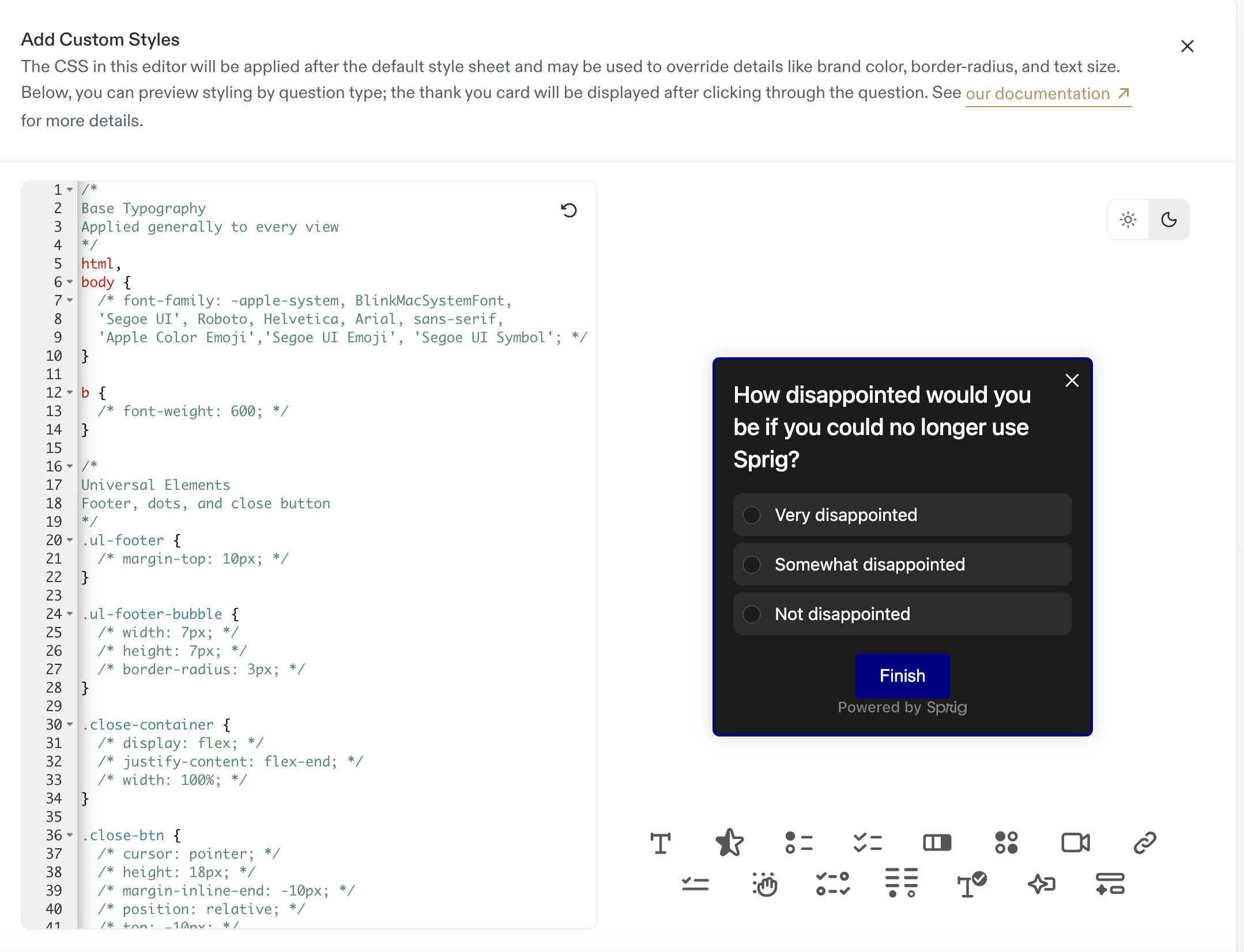
The other sits next to Preview Study in the study builder’s sidebar preview, and renders your actual survey questions, so you can confirm what respondents will see in each mode.
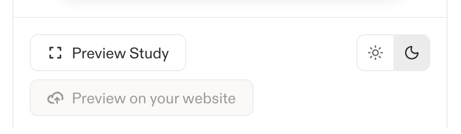
- Iterate in the CSS editor’s preview first: unsaved, useful for a sandbox.
- Once you save, confirm the result in the study builder’s sidebar preview against your real questions.
- Toggle your OS appearance (macOS: System Settings > Appearance; Windows: Settings > Personalization > Colors) only if you’re checking the survey somewhere neither switcher covers, like a live link.
- In Chrome DevTools you can also force the media query without changing your OS: open the Command Menu (
Cmd/Ctrl + Shift + P), run Show Rendering, and set Emulate CSS media feature prefers-color-scheme. - Step through every question type in the preview, not just the first card. Matrix, NPS, Rank Order, and Open Text have the most mode-specific styling.
Common issues
My colors work in light mode but not dark mode
My colors work in light mode but not dark mode
You most likely declared your variables on
html instead of :root. Sprig’s dark values are on :root, which has higher specificity, so it wins regardless of source order. Change your selector to :root.Text is unreadable (e.g. dark text on a dark card)
Text is unreadable (e.g. dark text on a dark card)
You have a hardcoded foreground color with no matching background, or vice versa. Search your CSS for any literal hex value on a
color, background, or border-color property and either move it into a variable pair or wrap the dark variant in a @media (prefers-color-scheme: dark) block.A white seam or flash appears around the card in dark mode
A white seam or flash appears around the card in dark mode
Something in the card’s ancestry still has a light background. Reset the wrappers to transparent so the host page shows through:
An icon or chevron is invisible in dark mode
An icon or chevron is invisible in dark mode
Some Sprig icons are inline SVG data URIs with a fixed stroke color. Sprig’s dark stylesheet replaces the affected ones, but if you’ve overridden a background shorthand you may have wiped the replacement. Set
background-color rather than background, or re-declare the background-image in your dark block.Dark mode isn't activating at all
Dark mode isn't activating at all
Confirm three things: Enable Default Dark Mode CSS is switched on in Look & Feel settings (it’s off by default), you’re on Web SDK v2.49.0 or later or a mobile SDK version built against it (see Minimum SDK versions), and the test device’s OS appearance is actually set to Dark.The toggle applies per Product, not per environment: a Product’s development and production environments share one setting. If dark mode works in one place and not another, check whether you’re comparing two different Products rather than two environments of the same one. Both the study builder’s preview and the custom CSS editor’s preview have their own sun/moon switcher, see Testing your CSS, so you can rule out an OS-level mismatch by checking either one directly.
Mobile SDKs
Studies rendered in the iOS, Android, React Native, and Flutter SDKs use the same web stylesheets inside a web view, so everything on this page applies there as well. Native light/dark support (the SDK letting the web view render dark at all) landed earlier than the default CSS work, which is why some customers were already shipping their own dark mode CSS before v2.49.0. The mobile SDKs also expose APIs to force a study into light or dark mode regardless of the device setting: all include a method calledoverrideUserInterfaceMode, which takes dark, light, or unspecified. This lets an app align the survey’s theme with its own custom settings; passing unspecified resets it to match the device again.
Minimum SDK versions
These are the first mobile SDK releases built against Web SDK v2.49.0, and therefore the first to include the default CSS dark mode styles.These versions gate only Sprig’s default dark stylesheet. You don’t need any of them to write your own
prefers-color-scheme CSS, that’s plain custom CSS and always has worked on any SDK version. The default just gives you a baseline dark setting to start from or override.For the full list of selectors and non-color customization options, see Styling Studies with Custom CSS.