

Survey Customization
Adding custom CSS, logos and positioning allows you to tailor In-product and link surveys to match your company branding. Common styling changes include, but are not limited to:- Add a company logo (link surveys only)
- Change the font and font colors
- Move location of the close button
- Change the shape of the survey container
- Enable/Disable the Sprig signature - Enterprise only
Logo
Use this option to upload a logo that will be displayed in Shareable Link or Survey studies. File types supported include GIF, JPEG, and PNG.Survey Appearance
Positioning is only available for in-product Website Surveys and applies to all relevant Surveys at a Product level.Desktop
By default, on desktop/tablet screens, Sprig in-product Surveys will appear in the bottom right corner of your web application, but you can change that to also support:- Bottom left
- Top left
- Top right
- Centered Modal
Mobile
On mobile devices, Sprig Surveys always appear at the bottom of your web application. By default, your website will still be visible as normal on the remainder of the screen and users will be able to interact with it. In addition, you may choose either a light or dark overlay to focus attention on the survey. In this case, you have the option to allow/disallow the survey to be exited by clicking outside the study.Study Style
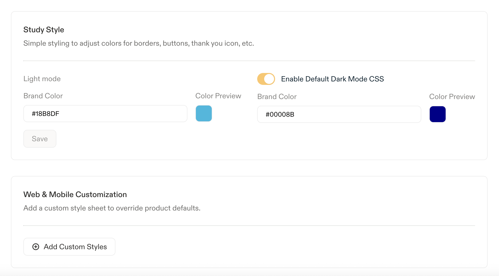
The color setting adjusts the primary color of the feedback prompt: the survey border, button background, and radio fills all pick it up. Enter any valid hexadecimal (e.g.#18B8DF) or RGB (e.g. rgb(24, 184, 223)) color code. The default brand color is a warm charcoal, #2f2e2c.
If you enable Default Dark Mode CSS, a second Brand Color field appears for dark mode, so light and dark studies can use different colors instead of sharing one. The default brand color on dark mode is #faf9f8. In this example, the survey’s brand color is #18B8DF for light mode and #00008B for dark.
In-Product Website Survey Customization
By adding custom CSS, this feature enables you to tailor website surveys to reflect your brand accurately. Common use cases to update your CSS stylesheet are, but not limited to:- Change the font
- Move location of the close button
- Change the shape of the survey container
- Update font color for question titles
- Custom button styling
Adding Custom CSS to a Survey study
- Head over to the Surveys > Look & Feel section in Settings.
- Select Add Custom Styles to open the custom CSS modal
- Select a question type and Update Preview to observe how your applied styles impact that particular question
- Accept the disclaimer and select Apply Styles to make your changes to the studies for which you modified CSS styling
👍 Survey CSS styling applies on per product basis Any new study created will be styled as configured under Surveys > Look & Feel Updating CSS styling will apply to all surveys, including active ones.
Supported CSS Classes
Survey Styles:
Warning: Styling may be limited if using unsupported SDK CSS selectors While you are able to customize your study layout with any SDK CSS selectors, we highly recommend sticking to the CSS classes listed above for the best support. Please reach out to Customer Success if there are additional CSS selectors you’d like to have supported.